NewsreaderDisplay and headingsWeights 400-500
Turn more searches into sales.
Brand guidelines / V1.4 / July 2026
Clear and credible beats loud.
Enok is a senior search team, and the brand should feel like one: editorial, warm, and precise. These standards keep the identity, interface, evidence, and writing consistent everywhere the company appears.
01 / Identity
The mark is a wave gathering forward. It may work alone in tight spaces, while the horizontal lockup carries the full name with a fixed proportion and optical baseline.

Lockup construction
Set the mark left of the Jost SemiBold wordmark, align both to the visual baseline, and use a gap of roughly half the mark width. The wordmark remains Jost 600, uppercase, with its production tracking intact.
 Enok SEOEnok SEOEnok SEOEnok SEO
Approved backgrounds
Enok SEOEnok SEOEnok SEOEnok SEOEnok SEOEnok SEOIcon treatments

Misuse
Social safe areas
Social banners use an Ink field with the Ivory lockup. Keep profile-image zones open, export at the exact platform size, and never place the lockup on photography.
Enok SEOEnok SEOEnok SEOEnok SEOEnok SEO02 / Color
Ivory, Sand, Clay, Ink, and Pine create the editorial field. Signal Green is reserved for action and high-value emphasis. Functional colors communicate state, never decoration.
#F6F3EBPrimary canvas#EFEBDDWarm secondary surface#EAE4D4Supporting section band#FFFEFACards and quiet contrast#191713Primary text and dark field#14241CPrimary brand field#1B2E23Cards on pine only#2EE06BPrimary action and signalUse Ink for labels, buttons, icons, diagrams, and data marks on Signal Green. Signal Green on Ivory is decorative only and never carries required text.
Functional palette
#29C95FPrimary-action hover
#0F9D44Large or underlined links
#0A7A33Accessible green emphasis
#EAFBECSuccess background
#A6946EEditorial secondary accent
#A3402FError text and icons
#D06A54Negative data accent
#7E3122High-contrast error state
#FBEBE7Error background
03 / Typography
Newsreader carries hierarchy, EB Garamond carries the argument, Hanken Grotesk handles every functional label, and Jost appears only inside the approved wordmark.
Turn more searches into sales.
Customers find brands they trust through search, social media, and AI. Enok makes your brand the one they find.
Navigation, labels, controls, captions, and data stay quiet, direct, and easy to scan.
Enok SEO04 / Layout and backgrounds
Build open, full-width bands around constrained content. One concept earns each section, one action receives visual priority, and the rising curve marks a real change in the argument.
Use the production 8px scale for component spacing and larger section rhythm.
Hub pages begin on Ivory, deepen as the argument advances, and end on Ink.
05 / UI elements
Controls are restrained and literal. Hanken Grotesk labels the action, 1px rules create structure, and comparison surfaces keep the same anatomy so differences stay easy to read.
Actions
Hover or focus a pill, then press it to see the state change. Shadows stay small: 2px down with an 8px blur at rest, 3px down with a 10px blur on hover. Dark hover is warm charcoal. Green and dark show priority, not price.
Form states
Enter a full email address, such as name@company.com.
Keep labels visible and errors beside the field. Brick marks the border, icon, and helper text, so color is never the only signal.
Tinted elevation
Panels use warm Tan or deep Pine shadows. CTA pills use the smaller green or ink shadows shown here, with a tonal fill and an inset highlight.
Disabled buttons cannot activate. A loading action keeps its label and colors, announces progress, and blocks repeat submission. CSS alone does not disable a link.
Card parity
The site, made crawlable.
The trust, earned.
Diagnosis comes before a package, price, or prescribed list of deliverables.
06 / Imagery and graphic language
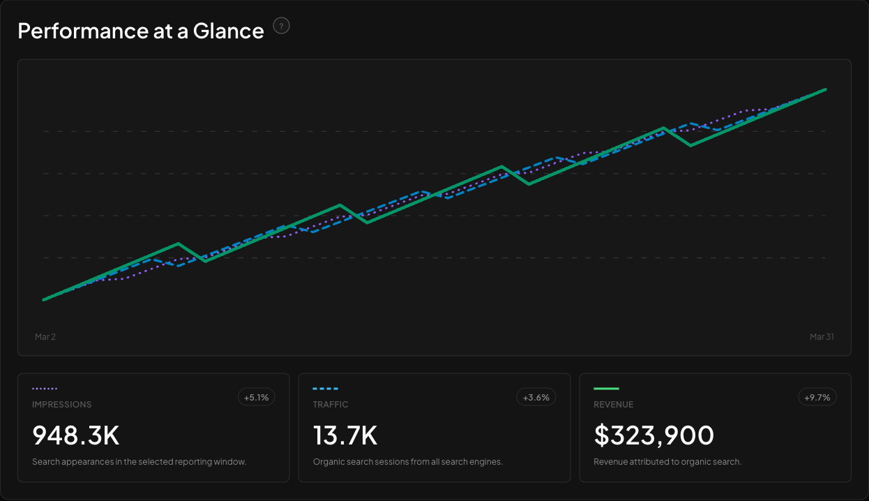
Photography and screenshots prove who did the work and what the product does. Diagrams use thin lines, circles, orbits, and the rising swoosh only when they clarify a relationship.
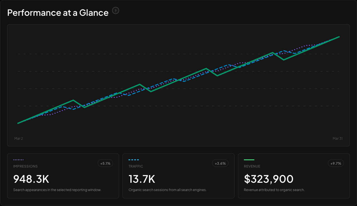

Hierarchy comes from radius, line weight, and labels. Signal Green identifies one point of focus.
The logo's trajectory becomes a section transition and CTA detail, never a repeated wallpaper motif.
Browser and report frames explain a real product moment with one highlighted customer result.
07 / Motion
Animation supports the product story without delaying access to the content. The meaningful still state is always complete.
Ambient search, orbit, and typing sequences run for 11 to 18 seconds so the page feels active without becoming busy.
Movement must explain ranking change, system relationships, progress, or state. Decoration alone is not a reason to animate.
Content may fade up by 24px over 700ms with a short stagger. Interface feedback stays brief and immediate.
Reduced-motion mode stops ambient loops, removes entrance movement, and preserves every label, value, and action.
08 / Voice
Use plain business language, concrete outcomes, and supportable claims. Confidence comes from judgment and evidence, not urgency or inflated adjectives.
Sounds like Enok
"More sales from the traffic you do not pay for."
"Diagnosis first. Then the work."
"We will tell you honestly whether Enok is the right partner."
Short declaratives. Specific outcomes. Clear limits.
Never
"Skyrocket your rankings with cutting-edge AI!"
"Guaranteed number one results or your money back."
"Synergistic omnichannel search domination."
No hype, no guarantees, no jargon walls, no emoji, and no em dashes.
Section titles
Structural copy can carry a little dry wit while the supporting argument stays factual.
CTA lines
The ask is direct and human, with a clear outcome instead of generic funnel language.
Claims
Identify the source, timeframe, attribution boundary, and uncertainty whenever they affect the decision.
09 / Accessibility
WCAG 2.2 AA is the minimum. Approved pairings, semantic structure, visible focus, full keyboard access, reduced motion, and 320px reflow are release requirements.
AAA, any text
AAA, any text
AAA, CTA labels
AAA, headings and accents
24px+ or underlined links only
AA, error text and icons
Never text; decorative only
Every interactive element has a high-contrast focus ring that remains visible on light and dark fields.
Use landmarks, one literal H1, ordered heading levels, useful alt text, descriptive links, and status text that does not rely on color.
Layouts must reflow at 320px without document-level horizontal scrolling, preserve source order, and provide 44px minimum touch targets for controls.
Ambient loops stop and transitions become immediate while the complete still state remains available.
10 / Downloads and press assets
Use the production files below instead of screenshots, copied logos, or recreated wordmarks. Each download keeps the approved proportions and source quality intact.
Press boilerplate
"Enok SEO is a senior search team. Customers find brands they trust through Google, social media, and AI instead of just ads. Enok makes your brand the one they find, and makes your website easy to buy from. Learn more at enokseo.com."
Use as one paragraph. Edits require owner approval.
Name in print
11 / Governance
The guide is versioned, the owner is named, and exceptions have one documented path. Narrative fields may be edited in Metatron, while design tokens, assets, ratios, and component rules remain code-controlled.